
Screens, tabs and the header
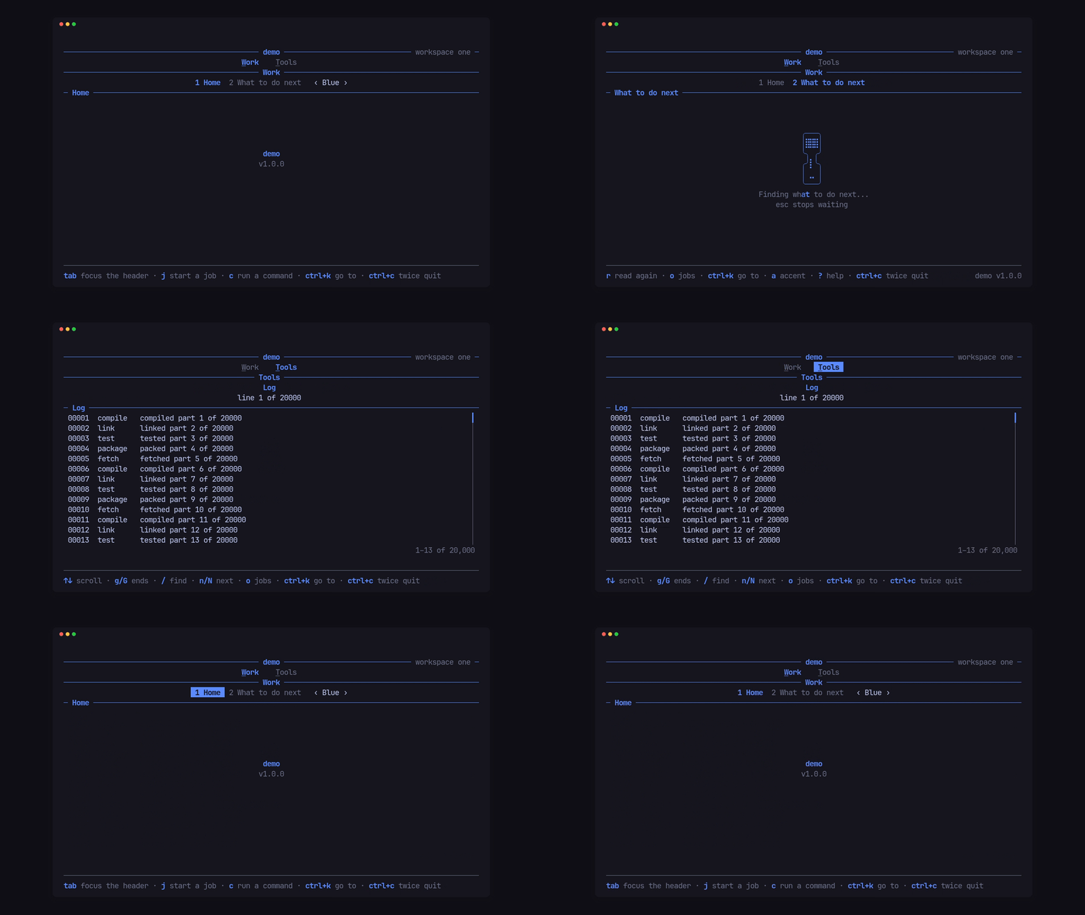
Each screen is a type that implements Screen<E>, where E is the app’s own
message type (the answers its workers send back; () when it has none). A
screen draws its area, takes its keys, and says what it shows in the header
and the footer. Every method but draw has a default.
Add screens as tabs
Section titled “Add screens as tabs”Tui::new("demo", VERSION, accent) .screen(Section::new("Home"), home) .screen(Section::new("What to do next").short("Next"), Next::new()) .screen(Section::new("Log"), Journal::new()) .run()The shell draws them as numbered tabs. With the default keys (NavKeys::HEY)
tab and shift+tab move between groups (between tabs when there is one
group, as here), ] and [ between the tabs of a group, a digit goes to that
tab, and esc or q go back. Tui::nav_keys(..) changes them, and
NavKeys::NONE turns them off. .short(..) is the name used when the full one
doesn’t fit. A screen is started the first time it is shown, and hears
entered each time the nav brings it up again.
What a screen tells the header and footer
Section titled “What a screen tells the header and footer”impl Screen<Msg> for Journal { fn draw(&mut self, frame: &mut Frame, area: Rect, palette: &Palette) { self.log.draw(frame, area, palette); }
fn facts(&self) -> Vec<(String, Style)> { let line = format!("line {} of {}", self.log.top() + 1, self.log.len()); vec![(line, Style::new())] }
fn hints(&self) -> Vec<Hint<'_>> { vec![ Hint::new("↑↓", "scroll"), Hint::new("g/G", "ends").rank(2), Hint::new("/", "find").rank(1), ] }}factsis the row under the tabs (“line 11998 of 20000”).hintsare the footer’s key hints. The footer fits them to the width: a hint with a higherrankis dropped first, and apinned()hint (the app’sctrl+c twice quit, say) always stays.statusorstatus_parts(room)sit on the right of the title rule, andlead(room)on its left beside the help word; each is told the room it has, so it can drop a part rather than see it cut.noticekeeps a line in the footer in any tone for as long as the screen returns it;Cx::say(text, tone)shows one until the next key.
Drill in with a breadcrumb
Section titled “Drill in with a breadcrumb”A screen that opens something returns its name from crumb; the sections
row becomes the breadcrumb, and the nav’s back key calls back:
fn crumb(&self) -> Option<String> {    self.opened().map(|step| step.title.to_string())}
fn back(&mut self, _cx: &mut Cx<'_, Msg>) {    self.open = None;}
The facts row goes while a screen is drilled in, unless the app keeps it with
Tui::keep_facts(true).
Group tabs
Section titled “Group tabs”Tui::group(..) before the screens that belong to it starts a group; screens
before any group join one unnamed group, and a single group draws no groups
row. Tui::group_keys(&[..]) gives the group added last its own keys, which
return to that group’s last-used tab.
The header as a stack of rows
Section titled “The header as a stack of rows”Tui::head(Head::new([..])) draws the header from rows in the app’s order.
This is the demo’s --stack header in the clip above:
let head = Head::new([    Row::Title,    Row::Groups,    Row::Caption,    Row::Sections,    Row::Facts,    Row::Crumbs,]).numbers(Numbers::InGroup).lone(true);
let key = Style::new().add_modifier(Modifier::UNDERLINED);tui.head(head) .focus_keys(&[Key::Tab], &[Key::BackTab]) .group(Label::spans([("W", key), ("ork", Style::new())])) .group_keys(&[Key::Char('w')]) .screen(Section::new("Home"), home) .screen(Section::new("What to do next").short("Next"), Next::new()) .group(Label::spans([("T", key), ("ools", Style::new())])) .group_keys(&[Key::Char('t')]) .screen(Section::new("Log"), Journal::new())Numbers::Acrossnumbers tabs across the app,InGroupfrom 1 in each group,Offnot at all;lone(true)leaves a group of one tab unnumbered. Number keys follow what is drawn.Row::Captionis a ruled label between two rows: the current group’s name, or the screen’scaption().focus_keys(next, previous)moves keyboard focus through the groups row, the sections row, the after-tabs slot and the content. Left and right move along the focused row, up and down between rows,escorentergive focus back.Screen::after_tabs()puts the screen’s own spans after the tabs, a “‹ Blue ›” selector here, and keys reach the screen there withCx::focus()sayingFocus::Slot.Tui::show(..)andCx::show(..)show or hide groups and tabs by the app’s predicate (Item::Group(n),Item::Tab(screen)).
Without head, the header is pito-header’s default layout: title, groups,
sections, facts and crumbs.
One app-wide screen
Section titled “One app-wide screen”Tui::app(screen) adds a screen that is never drawn as content. Its lead,
left and status_parts feed the title rule on every screen, and it hears
app-wide keys first in claim:
impl Screen<Msg> for App {    fn draw(&mut self, _frame: &mut Frame, _area: Rect, _palette: &Palette) {}
    fn claim(&mut self, key: KeyEvent, cx: &mut Cx<'_, Msg>) -> bool {        if key.code != KeyCode::Char('k') || !key.modifiers.contains(KeyModifiers::CONTROL) {            return false;        }        cx.open(go_to());        true    }}
Next: Load data without blocking.