
Ask the user: confirm, pick and modals
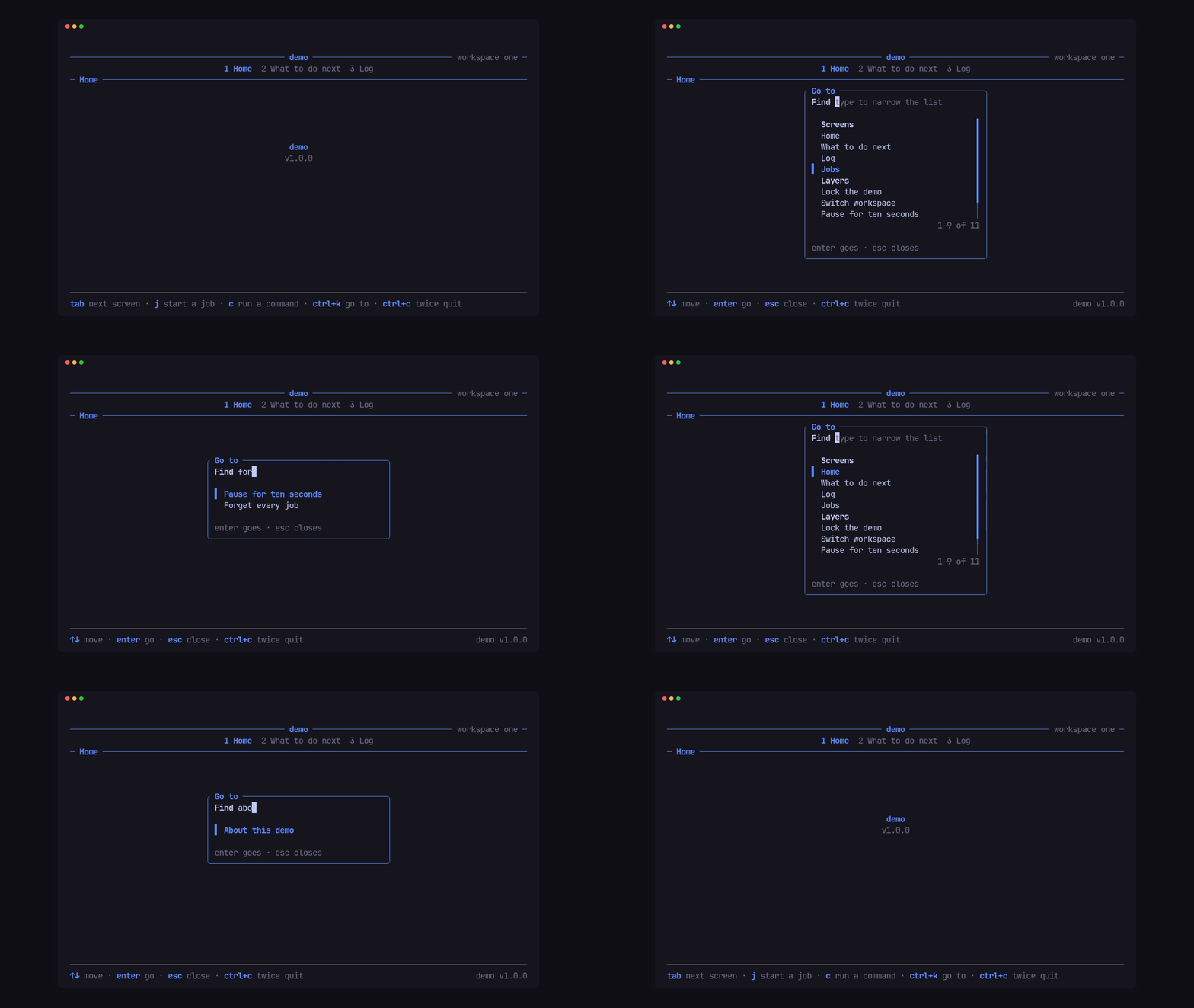
Every prompt answers the screen (or the app slot) that opened it, and owns the keys while it is open.
Yes or no
Section titled “Yes or no”fn key(&mut self, key: KeyEvent, cx: &mut Cx<'_, Msg>) { if key.code == KeyCode::Char('d') { cx.confirm("Delete this draft?"); }}
fn answer(&mut self, yes: bool, cx: &mut Cx<'_, Msg>) { if yes { cx.say("Deleted.", footer::Tone::Good); }}The confirm bar takes the footer, with the app’s Words::yes, no and
choose. Cx::confirm_with(question, Confirm) takes pito-footer’s
Confirm for other keys. Tui::through_keys(&[..]) lets chosen keys (a
ctrl+r refresh, say) past an open confirm.
Pick one
Section titled “Pick one”let pick = Pick::new("Accent", ["Blue", "Amber", "Pink"]) .selected(self.accent) .hints([ Hint::new("↑↓", "move"), Hint::new("enter", "choose"), Hint::new("esc", "cancel"), ]);cx.pick(pick);The answer comes back in picked(Option<usize>, cx): None when cancelled.
Arrows (or j, k, g, G) move, enter chooses, esc or q cancels.
Pick::full(true) fills the screen’s area instead of a box, and
Pick::columns or Pick::rows lay the rows out in the app’s own columns.
$ demo --dump 64x16 --keys "p down"
 ──────────────────────────── demo ──────────── workspace one ─                1 Home  2 What to do next  3 Log ─ Home ───────────────────────────────────────────────────────
                    ╭ Accent ──────────────╮                    │  Blue                │                    │▌ Amber               │                    │  Pink                │                    ╰──────────────────────╯


 ────────────────────────────────────────────────────────────── ↑↓ move · enter choose · esc cancel · ctrl+c twice quit
Modals
Section titled “Modals”Cx::open(Modal) puts a centred, bordered, titled container over the live
screen, which keeps drawing. Its body is built from parts in order: text,
a list of Choices, and fields; tab and shift+tab move focus
between them. The demo’s ctrl+k “Go to” list is one:
const GO: u64 = 1;
fn go_to() -> Modal {    let heading = |text: &str| {        Choice::spans([(text.to_string(), Style::new().add_modifier(Modifier::BOLD))]).skip()    };    Modal::new(GO, "Go to")        .field(Field::new("Find").placeholder("type to narrow the list"))        .list([            heading("Screens"),            Choice::new("Home"),            Choice::new("Log"),            heading("Layers"),            Choice::new("Forget every job").confirm("enter again forgets every job"),        ])        .filter(0, 1)        .status("enter goes · esc closes", Tone::Muted)        .hints([            Hint::new("↑↓", "move"),            Hint::new("enter", "go"),            Hint::new("esc", "close"),        ])}
filter(field, list)narrows the list (part 1) as the field (part 0) is typed.Choice::skip()is a heading the cursor passes over.Choice::confirm(warning)needs a secondenter, and shows its warning on the status line.
Its owner hears what happens in layer(id, Event, cx):
fn layer(&mut self, id: u64, event: Event, cx: &mut Cx<'_, Msg>) { if let (GO, Event::Chosen { choice, .. }) = (id, event) { cx.close(GO); self.act(choice, cx); }}Event is Chosen, Moved, Edited, Submitted or Closed, each with
the part it came from. Cx::modal(id) changes the rows and the status while
it is open (set_choices, set_status, value(part) reads a field), and
Cx::close(id) closes it.
Modals stack, so an alert can sit over a form. Cx::alert(id, title, lines)
or Modal::alert(..) is a dismiss-only one: esc, enter or q closes it.
$ demo --dump 100x24 --keys "ctrl+k" ────────────────────────────────────────────── demo ────────────────────────────── workspace one ─                                  1 Home  2 What to do next  3 Log ─ Home ───────────────────────────────────────────────────────────────────────────────────────────                              ╭ Go to ───────────────────────────────╮                              │ Find type to narrow the list         │                              │                                      │                              │   Screens                          ┃ │                              │ ▌ Home                             ┃ │                              │   What to do next                  ┃ │                              │   Log                              ┃ │                              │   Jobs                             ┃ │                              │   Layers                           ┃ │                              │   Lock the demo                    ┃ │                              │   Switch workspace                 ╿ │                              │   Pause for ten seconds            │ │                              │                            1–9 of 11 │                              │                                      │                              │ enter goes · esc closes              │                              ╰──────────────────────────────────────╯

 ────────────────────────────────────────────────────────────────────────────────────────────────── ↑↓ move · enter go · esc close · ctrl+c twice quit                                     demo v1.0.0
A filter over a list
Section titled “A filter over a list”For a filter inside a screen rather than over it, Filter holds a pito-list
List, an input and the rows that match: / starts typing, enter keeps
the filter, esc clears it. The demo’s “What to do next” tab uses one:
Filter::key returns Turn::Filtered (sift the rows again) or
Turn::Open(index), and Filter::view(&columns, palette) draws the list.