Expand description
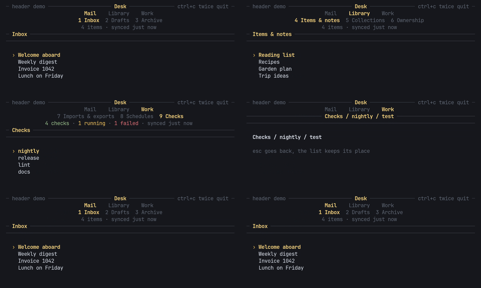
§pito-header


The top of a PITO MD terminal app, as a small ratatui 0.30 crate: groups of numbered sections in two nested rows, drill-in with a breadcrumb, and optional title, facts and notice rows, all abbreviating to fit the width. It has no app logic and no words of its own: the app passes in every name, every style and every key.
Works on Linux, Windows and macOS (CI-tested on all three).
§At a glance
| Full header, drawn at 150 columns | 8.7 µs a frame (mean of 200,000) |
| Nav rows alone / a click hit-test | 2.1 µs / 0.11 µs |
| Allocations while drawing or hit-testing | 0 (a counting allocator in the tests holds it) |
| Dependencies | 3: ratatui, unicode-segmentation, unicode-width; no terminal backend unless you turn on crossterm |
| Size | about 1,540 lines of Rust, 75 tests |
| Build | 22 s clean in release with every dependency, 0.5 s for the crate itself |
Measured on 2026-10-14 on an AMD Ryzen 9 9950X with Rust 1.97.1:
cargo run --release --example bench 200000 for the times, a clean
cargo build --release --lib and a rebuild after touching the crate for the
build. The chart under Fast has every case.
§Install and first use
Add it from git, pinned to a release tag (it is not on crates.io). The same line works on Linux, Windows and macOS:
cargo add ratatui
cargo add pito-header --git https://github.com/gmrdad82/pito-header --tag v1.0.1
Then build a nav, feed it keys and draw it:
use pito_header::{Group, Header, Key, Nav, Section};
use ratatui::{Frame, layout::Rect};

let mut nav = Nav::new(vec![
    Group::new("Mail").section(Section::new("Inbox")).section(Section::new("Drafts")),
    Group::new("Work").section(Section::new("Checks")),
]);
nav.key(Key::Char('3'));
assert_eq!(nav.place().number, 3);

fn draw(frame: &mut Frame, nav: &Nav) {
    let area = frame.area();
    let header = Header::new(nav).title(Some("Desk"));
    frame.render_widget(header, Rect { height: header.height(), ..area });
}
To see it move, clone the repository and run the demo at the top of this page:
git clone https://github.com/gmrdad82/pito-header && cd pito-header
cargo run --example demo --features crossterm
tab and shift+tab change group, ] and [ change section, a digit
jumps to a section, enter drills in, esc goes back and ctrl+c pressed
twice quits.
§Groups and numbered sections
Sections are numbered 1, 2, 3… across all groups, so a digit jumps anywhere
(0 is the tenth). The groups row sits over the current group’s sections,
centred, the current one in the accent and bold, and every group remembers
its section. The GIF at the top is examples/demo.rs.
Keys map to actions, and nothing is taken behind the app’s back:
action(key) only looks, apply(action) moves, and key(key) does both.
Every key set is configurable through NavKeys (NavKeys::NONE takes
nothing), so tab, [ ], digits or q can keep other meanings in an app,
and back at the top level is never an action, so esc stays the app’s there.
§Fits any width
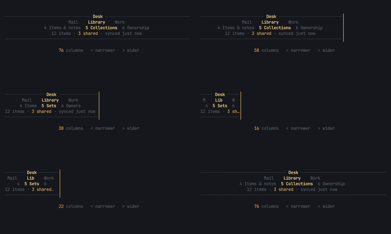
When the width runs out, the rows abbreviate step by step and never wrap:
full names, then each section’s short name, then only the current one named,
then numbers only. A group falls back to its short name, then its first
letter. Facts elide with “…”, and the title’s side slots drop before the
title does. Widths are measured per cell with Unicode widths, so diacritics
(ă, î, ș, ț), “…” and wide glyphs clip cleanly. This is examples/fit.rs.
§Drill-in with a breadcrumb
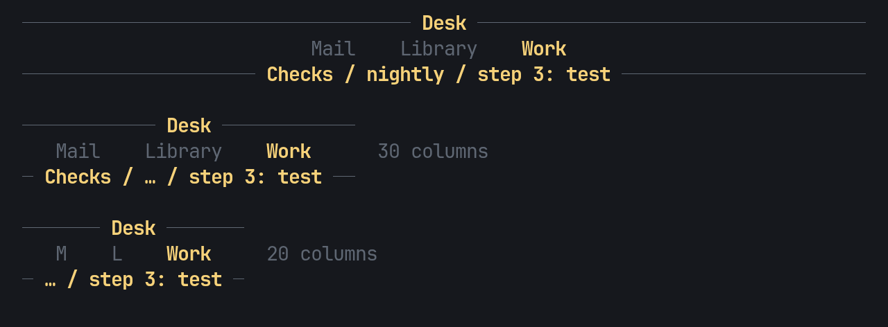
open(title, selected) goes one level deeper and remembers the list’s
selection; back returns it, so the list comes back where it was. Each section
keeps its own stack while you move around. While drilled in, the header
swaps the sections row for a breadcrumb rule, as HEY’s terminal UI does, and
the breadcrumb elides its middle, then its head, when it doesn’t fit.
use pito_header::{Drill, Group, Header, Nav, Section};

let mut nav = Nav::new(vec![
    Group::new("Library").section(Section::new("Ownership")),
    Group::new("Work").section(Section::new("Checks")),
]);
nav.open("build queue", 3);
assert_eq!(Header::new(&nav).crumbs(true).height(), 2);
assert_eq!(Header::new(&nav).crumbs(true).drill(Drill::Rows).height(), 3);
assert_eq!(nav.back(), Some(3));
Back brings the sections row back with the selection kept, and clicks on the
breadcrumb rule hit nothing. An app that wants the breadcrumb on a row of its
own passes .drill(Drill::Rows); the Breadcrumb widget stays for apps
that title their own content.
§Every row is optional
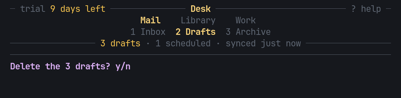
Header draws only the rows it’s given: a title rule with the name in the
middle and a left and a right slot, the nav rows, a facts row (on a rule or
plain, each fact styled by the app), a closing rule, and a notice row for a
result, a warning or a confirm question. A slot can hold several styles side
by side (left_parts), and text on a rule carries exactly its own style: the
rule’s DIM never leaks into it. A header with no sections (a dashboard)
draws only its other rows. This is examples/gallery.rs rows.
§Sections in several styles

Section::spans gives a section several styled spans, such as a host’s name
next to its state, and section_mut(..).set_spans(..) changes it in place
while the app runs, keeping the place, every group’s remembered section and
every drill stack. Each span draws over the cell’s style, so the current
section keeps its accent and bold. This is examples/gallery.rs spans.
§Clicks
The crate never reads the mouse; it answers where a click landed.
hit(area, column, row) names the group or section under the pointer, and
nothing outside the area:
use pito_header::{Header, Nav};
use ratatui::layout::Rect;

fn click(nav: &mut Nav, area: Rect, column: u16, row: u16) {
    let place = Header::new(nav).title(Some("Desk")).hit(area, column, row);
    if let Some(place) = place {
        nav.go_to(place.group, place.section);
    }
}§Fast
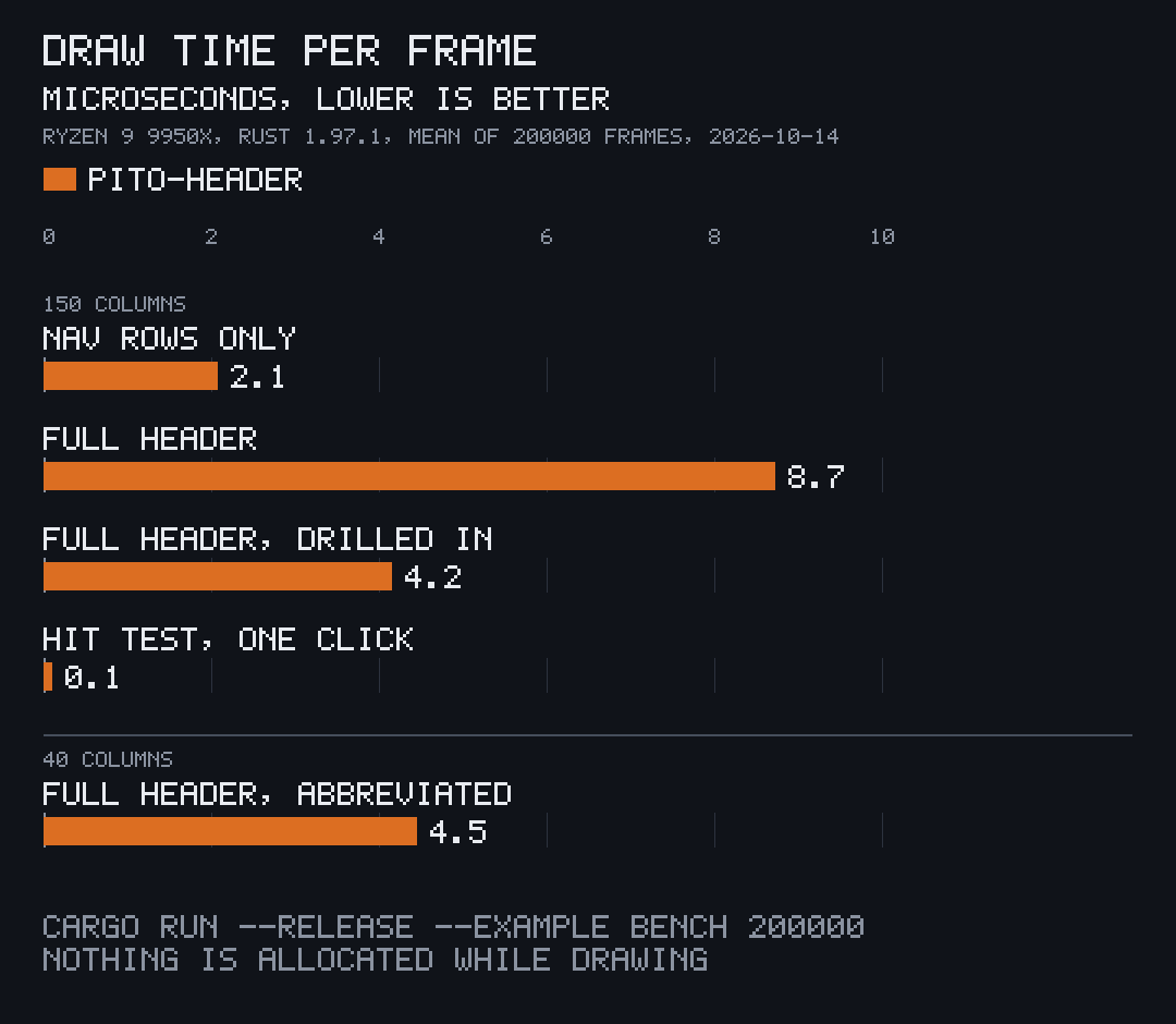
Drawing writes straight into ratatui’s buffer: no allocation, no clock, no
input and no randomness, so a frame costs microseconds and the same state
always draws the same cells. Run cargo run --release --example bench 200000 for these numbers on your machine; the chart is drawn by
pito-compare from
docs/images/draw-time.toml.
§Behaviour in detail
- Digits past the last section do nothing and fall through to the app,
unless
swallow_digitsis on: then they map toAction::Swallow, whichapplyanswers withStep::Swallowed, so the key is taken and nothing moves. Off by default, and only whiledigitsis on. cycle(by)andstep(by)move by the size ofby(negative goes back) and wrap.cyclecounts filled groups only and answersNonewhen there is no other group to go to;cycle(0)andstep(0)stay where they are and answer the place. With a single group,tabsteps sections.selected(group)reads any group’s remembered section, so the app can jump to a group at its remembered section withgo_to(group, section).- Texts the app owns as
Strings:facts_pairs,left_pairsandright_pairstake a slice of(String, Style)and draw it like theFactforms, so the app needs no parallelVec<Fact>each frame. - Empty facts are skipped, and a row of only empty facts takes no row.
The row elides with “…” only when the room left cannot hold the separator
and the next fact’s first two cells; a cut fact ends the row. An empty
titleis no title. When a slot is cut, the ellipsis takes the style of the part it cuts. - Control characters take no cell: a newline, tab or carriage return inside a text is drawn as one space, and one at either end is dropped, so a multi-line message reads as one line.
lit(false)keeps the group lit but dims the current section, for a page that sits over every section (help, settings).underline(true)underlines the section numbers.- The
crosstermfeature addsKey::from(crossterm::event::KeyEvent)(crossterm 0.29). It keeps Alt apart (Key::Alt('q')is notKey::Char('q'), so Alt+q is not Back), turns Alt, Super, Meta or Hyper on any other key intoKey::Other, and passes Ctrl+Alt plus a character on as that character, which is how AltGr arrives on some platforms, so diacritics can still be typed.
§The API
pub enum Key { Char(char), Ctrl(char), Alt(char), Tab, BackTab, Enter, Esc, Backspace,
               Left, Right, Up, Down, Other }          // non_exhaustive
pub struct Styles { accent, muted, rule }              // plain fields; Styles::new() and the builders are the stable way to build it
Section::new(name).short(short)
Section::spans(&[(text, Style)]).short(short)          // one label in several styles
Section::spans(..).short_spans(&[(text, Style)])         // the abbreviation in several styles
  section.set_name(..), set_spans(..), set_short(..), set_short_spans(..)   // change a label in place
Group::new(name).short(short).section(section)
Nav::new(groups).keys(NavKeys)
  place() -> Place { group, section, number }          // number is 1-based, 0 when empty
  selected(group) -> Option<usize>                     // the section a group remembers
  section(), section_mut(group, section) -> Option<&mut Section>
  count(), go(number), go_to(group, section), cycle(by), step(by)
  open(title, selected), back() -> Option<usize>, close() -> Option<usize>
  depth(), title(), crumbs(), breadcrumb() -> String
  action(Key) -> Option<Action>, apply(Action) -> Option<Step>, key(Key) -> Option<Step>
pub enum Action { NextGroup, PrevGroup, NextSection, PrevSection, Go(usize), Back, Swallow }   // non_exhaustive
pub enum Step { Moved(Place), Back { selected }, Swallowed }                                   // non_exhaustive
NavKeys { next_group, prev_group, next_section, prev_section, back: &'static [Key], digits,
          swallow_digits }                             // non_exhaustive; digits past the last section are taken
  NavKeys::HEY: tab / backtab, ] / [, digits, esc / q          NavKeys::NONE
  .next_group(..) .prev_group(..) .next_section(..) .prev_section(..) .back(..)   // const builders
  .digits(bool) .swallow_digits(bool)
NavBar::new(&nav).styles(..).lit(bool).groups(bool).underline(bool); height(), hit(..)
Breadcrumb::new(&nav).styles(..).centred(bool)
Fact::new(text, style)
pub enum Drill { Replace, Rows }                       // Replace by default; non_exhaustive
Header::new(&nav).styles(..).title(..).left(..).right(..).tabs(bool).lit(bool)
  .left_parts(&[Fact]).right_parts(&[Fact])           // a slot in several styles
  .left_pairs(&[(String, Style)]).right_pairs(&[(String, Style)]).facts_pairs(&[(String, Style)])
  .underline(bool).facts(&[Fact]).facts_rule(bool).separator(..).crumbs(bool)
  .closing(bool).notice(Option<Fact>).drill(Drill); height(), hit(..)
Every public enum, and NavKeys, are #[non_exhaustive]: match them with a
wildcard arm, and build a NavKeys from HEY or NONE and its methods, so a
later release can add to them in a minor version.
§A fuller example
use pito_header::{Fact, Group, Header, Key, Nav, Section, Step, Styles};
use ratatui::{Frame, layout::Rect, style::{Color, Modifier, Style}};

fn nav() -> Nav {
    Nav::new(vec![
        Group::new("Mail").section(Section::new("Inbox")).section(Section::new("Drafts")),
        Group::new("Library").section(Section::new("Items & notes").short("Items")),
    ])
}

fn key(nav: &mut Nav, key: Key, selected: &mut usize) {
    match nav.key(key) {
        Some(Step::Back { selected: kept }) => *selected = kept,
        Some(Step::Moved(_)) => *selected = 0,
        Some(Step::Swallowed) => {}
        Some(_) => {}
        None if key == Key::Enter => nav.open(format!("item {selected}"), *selected),
        None => {}
    }
}

fn draw(frame: &mut Frame, nav: &Nav) {
    let dim = Style::new().add_modifier(Modifier::DIM);
    let styles = Styles::new().accent(Style::new().fg(Color::Magenta)).muted(dim).rule(dim);
    let facts = [Fact::new("12 items", dim), Fact::new("synced just now", dim)];
    let header = Header::new(nav)
        .styles(styles)
        .title(Some("Desk"))
        .right(Some(Fact::new("? help", dim)))
        .facts(&facts)
        .crumbs(true);
    let area = frame.area();
    frame.render_widget(header, Rect { height: header.height(), ..area });
}§Part of PITO MD
pito-header is one of the ratatui crates behind PITO MD’s terminal apps:
- pito-tui: the app shell that brings this header, the footer, the hourglass and the list in one pin, with the paced loop, key routing and the quit guard.
- pito-footer: the bottom of the app: key hints that fit the width, a notice line, a y/n confirm, a one-line input and the double ctrl+c quit guard.
- pito-list: selectable list rows with columns that drop by priority, scrolling, paging and click hits.
- pito-hourglass: an hourglass to show while data loads.
The GIFs and stills on this page are recorded with prec and made with pconv, and the chart is drawn by pito-compare.
§Development
bin/gate runs cargo fmt --check, cargo clippy --all-targets --all-features -- -D warnings, cargo test --all-features (the tests draw
through ratatui’s TestBackend, a counting allocator holds that drawing and
hit-testing allocate nothing, and this README’s examples compile as
doctests) and builds the bench. bin/gate --fast leaves the bench build
out. CI runs on Linux, Windows and macOS: bin/gate --fast on every
branch and pull request, and bin/gate on main and nightly. bin/shots
records the GIFs and stills in docs/images/ from render/terminal.toml
and its tapes with prec and pconv, and draws the chart with pito-compare.
bin/docs-bundle builds the crate’s pages for the PITO MD docs site from
docs/pages/, CHANGELOG.md and cargo doc into
tmp/docs-vX.Y.Z.tar.gz, and the release workflow attaches it to every
tag’s GitHub Release.
§Contributing
Issues and pull requests are welcome. Please read the
code of conduct first. A change keeps bin/gate green
with no warnings, draws without allocating, and leaves every word, style and
key to the app. Report a security issue privately, as
SECURITY.md says, not in a public issue.
§Licence
The code is MIT licensed: see LICENSE, by Catalin Ilinca. The PITO
MD name and its logos are © Catalin Ilinca, all rights reserved, and are not
covered by the MIT licence: see TRADEMARKS.md. The look is in
the style of HEY’s terminal UI; see NOTICE.md, which also names
the images in docs/images/ and their sources.