Expand description
§pito-footer


The bottom of a PITO MD terminal app, as a small ratatui 0.30 crate: key hints that fit the width, a notice line, a y/n confirm, a one-line input, a quit guard and the app’s version. The look is in the style of HEY’s terminal UI. It has no app logic and no words of its own: the app passes in every hint, every word, every key and every style, so any language works.
- 8.4 µs to draw a row of twelve hints with a notice at 150 columns, and 38.5 µs for a frame that draws every widget the crate has: 0.23% of a 60 fps frame.
- Zero allocations while drawing: a counting allocator in the tests holds it.
- 3 dependencies: ratatui without its default features, unicode-width and
unicode-segmentation (crossterm 0.29 only with the
crosstermfeature). - 2,078 lines of Rust, rebuilt in 1.5 s after a change.
Works on Linux, Windows and macOS (CI-tested on all three).
§Install and first use
The same line on Linux, Windows and macOS, in the app’s Cargo.toml:
pito-footer = { git = "https://github.com/gmrdad82/pito-footer", tag = "v1.0.1" }
ratatui = "0.30"
Then put hints at the bottom of the screen:
use pito_footer::{Footer, Hint};
use ratatui::{crossterm::event, layout::Rect};

const HINTS: [Hint; 3] = [
    Hint::new("↑↓", "move"),
    Hint::new("enter", "open").rank(1),
    Hint::new("q", "quit").pinned(),
];

fn main() -> std::io::Result<()> {
    let mut terminal = ratatui::init();
    loop {
        terminal.draw(|frame| {
            let footer = Footer::new(&HINTS).version("app", "1.0.0");
            let area = frame.area();
            let height = footer.height(area.width);
            let bottom = Rect { y: area.bottom().saturating_sub(height), height, ..area };
            frame.render_widget(footer, bottom);
        })?;
        let quit = event::read()?
            .as_key_press_event()
            .is_some_and(|key| key.code == event::KeyCode::Char('q'));
        if quit {
            break;
        }
    }
    ratatui::restore();
    Ok(())
}
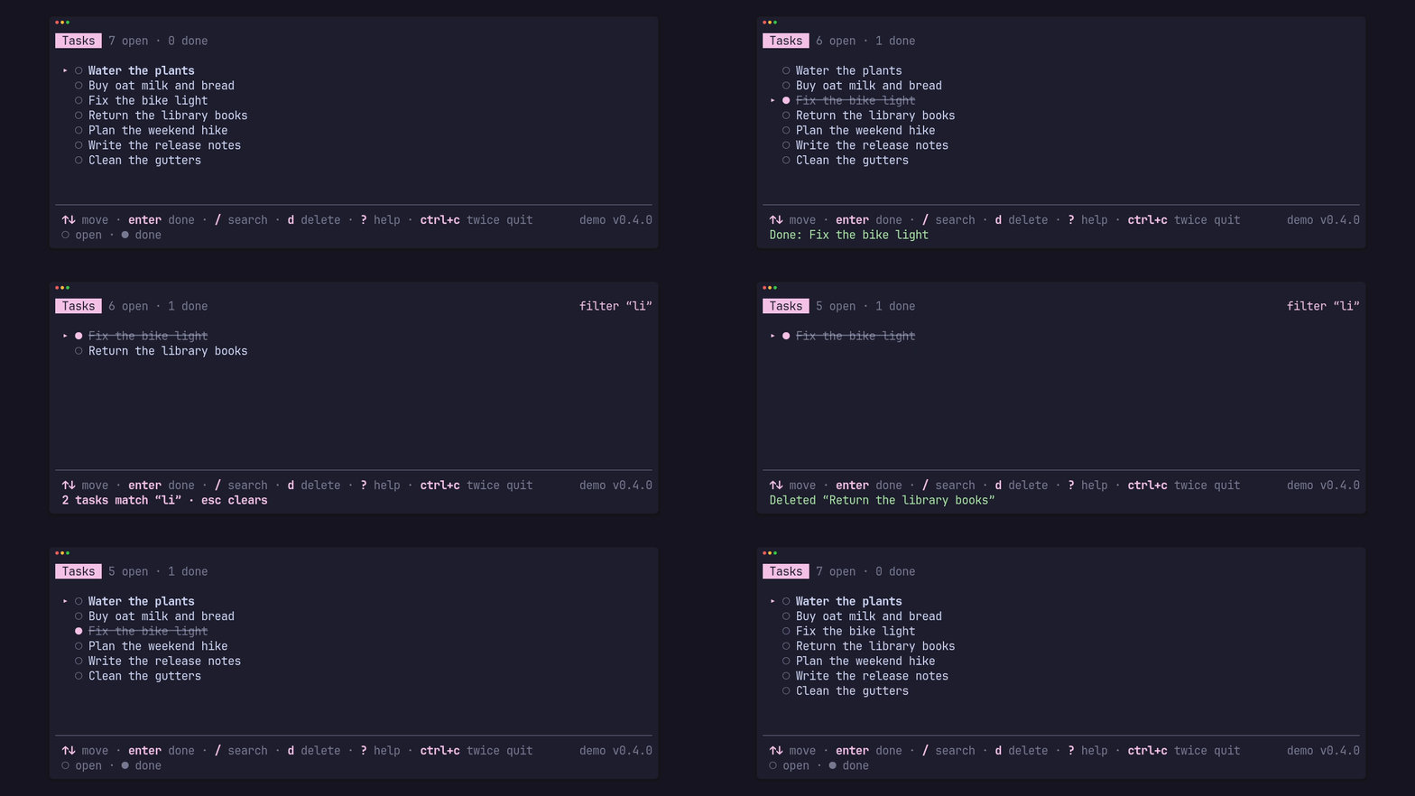
To see every part working, clone the repository and run the demo above, a task list with the footer at its bottom:
git clone https://github.com/gmrdad82/pito-footer && cd pito-footer
cargo run --example demo --features crossterm
Turn on the crossterm feature for Key::from(crossterm::event::KeyEvent)
(crossterm 0.29); without it the crate has no backend dependency. The
conversion keeps Alt apart (Key::Alt('y') is not Key::Char('y'), so Alt+y
does not answer Yes), turns Alt, Super, Meta or Hyper on any other key into
Key::Other, and passes Ctrl+Alt plus a character on as that character, which
is how AltGr arrives on some platforms, so diacritics can still be typed.
§Hints that fit the width
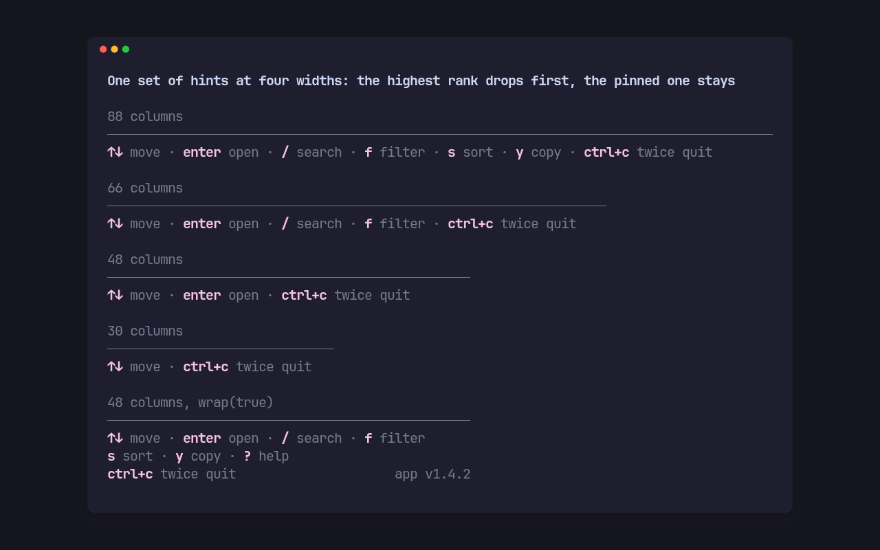
Each Hint is a key, a label and a rank. When the width runs out the highest
rank drops first, the order is kept and a pinned hint goes last of all; the
app’s version, when it has one, goes before any hint. wrap(true) flows every
hint over as many rows as it needs instead, and height(width) says how many
rows to give it. shown(key, width) tells the app whether a key’s hint is on
screen, so it can accept only the keys it shows. ? shows or hides the hints
through Help.
§A notice line
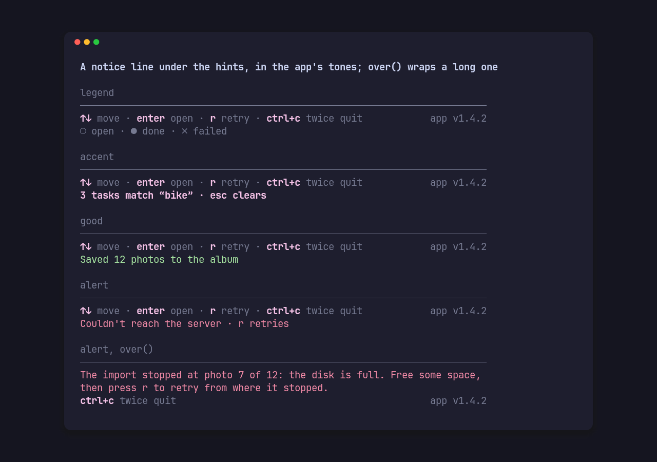
Under the hints sits one line for a legend, a result or a warning, in the
app’s ink, muted, accent, alert or good style. A notice marked over() that is
too long for one row takes the hint rows’ place and wraps across them, and the
pinned hints stay on the last row under it.
§A status row
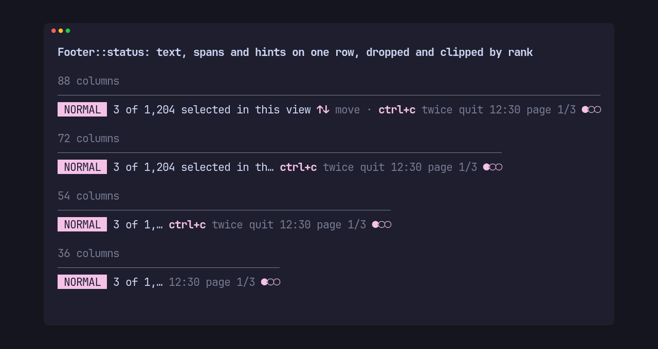
Footer::status lays out text, styled spans and hints on one row, left or right
aligned. The highest rank drops first, a segment marked shrink() is clipped
to the space left with one “…”, and Segment::spans keeps several styles in
one segment, so a percentage or page dots carry their own colour.
§A one-line input, and a masked one for keys
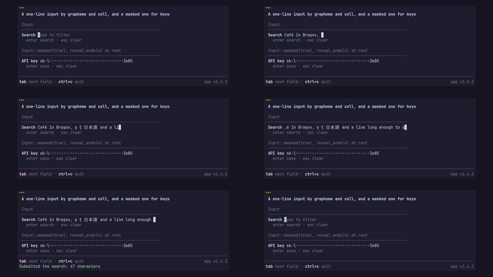
Input edits by grapheme and cell, so diacritics, combining marks and wide
glyphs move and delete whole: left and right, home and end, ctrl+a and ctrl+e,
backspace and delete, ctrl+u and ctrl+w, and a bracketed paste kept on one
line. InputBar draws the label, the text with its caret and the hint, and
scrolls with “…” at either cut end to keep the caret in view.
Input::masked(true) draws every character as • and never reveals anything
while the user types; a stored key shown at rest can opt in to its ends with
reveal_ends(n).
§A confirm, and a quit guard
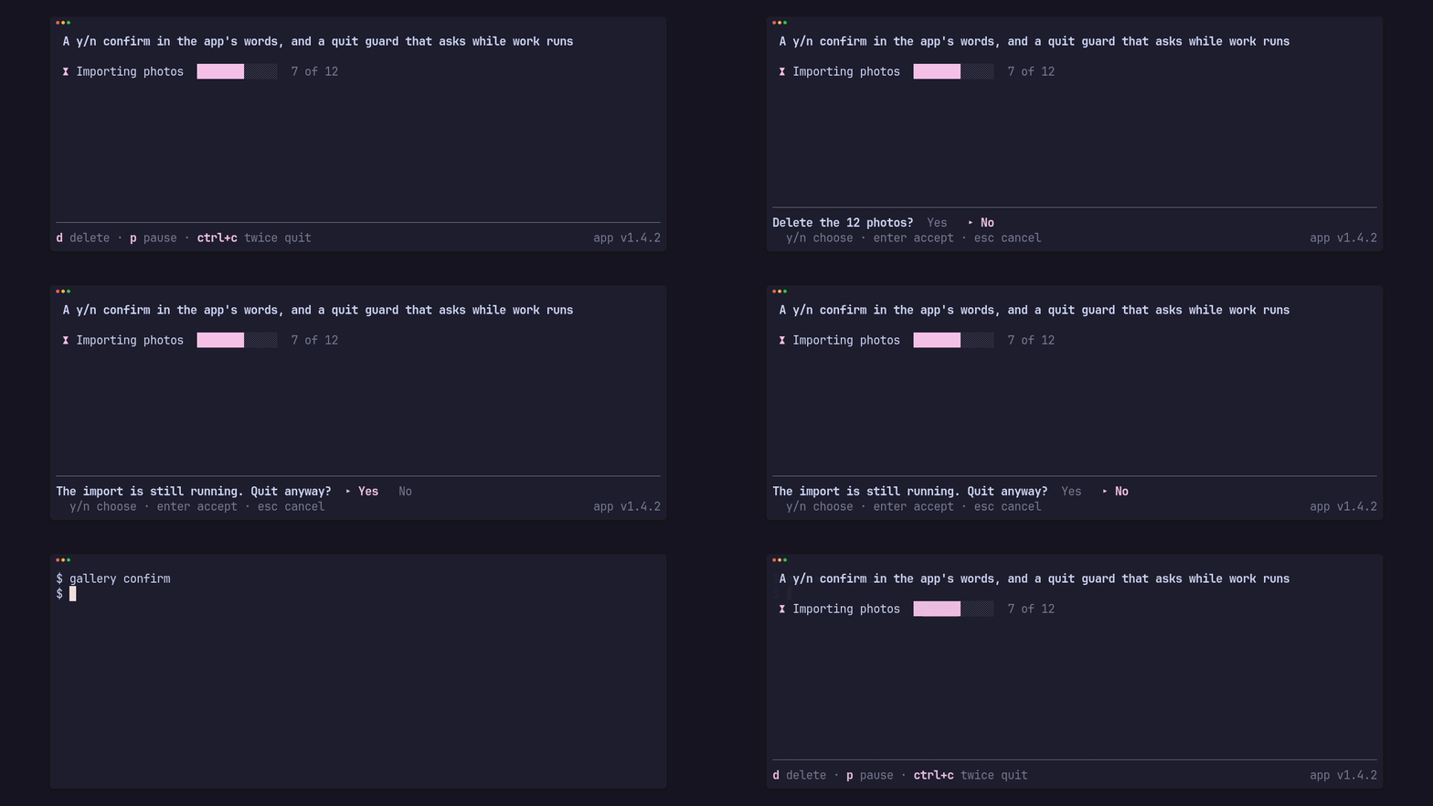
ConfirmBar draws “Question? Yes ▸ No” in the app’s words, over a hint line
or inline, and Confirm returns the answer and never runs anything. The
QuitGuard arms on the first ctrl+c, shows the app’s “again” notice and quits
on a second press inside the window; in Mode::Ask it asks through a confirm
first while the app says work is running. Every key call says what happened,
and the crate never reads input, the clock or the mouse itself.
§Speed
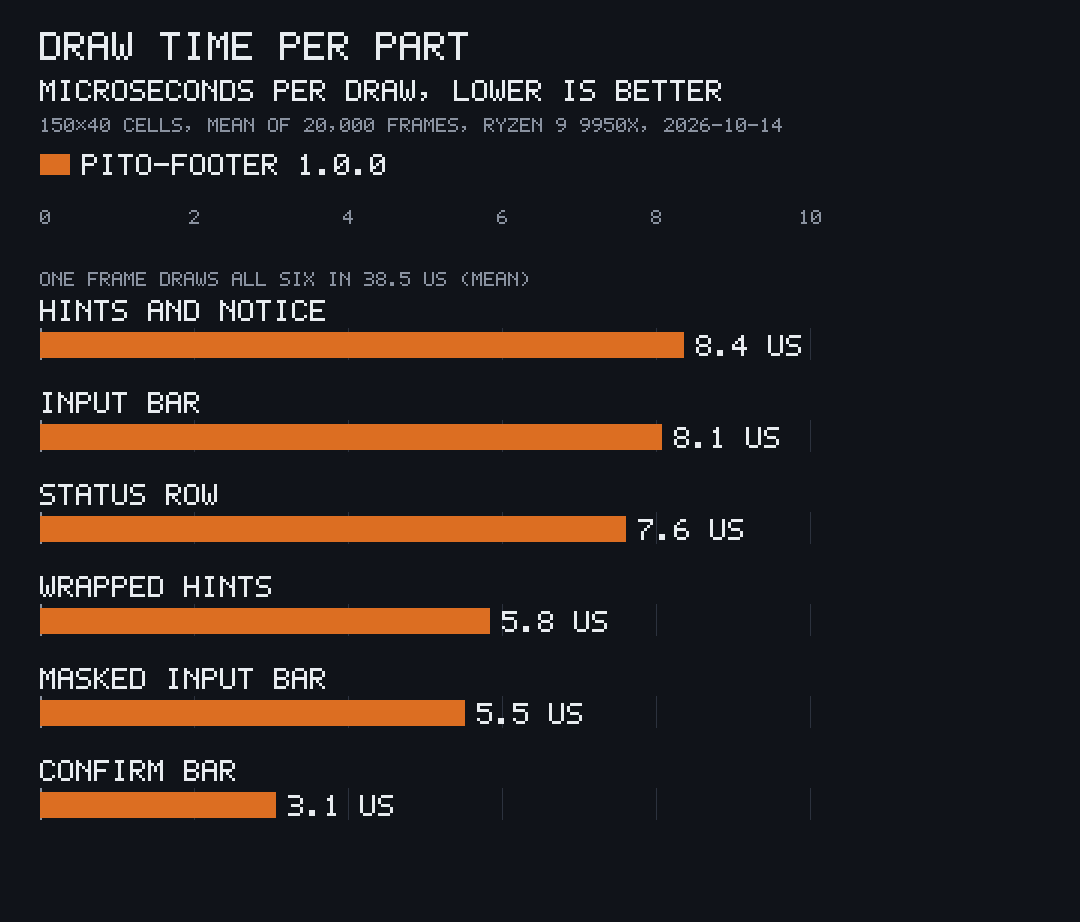
Drawing writes straight into ratatui’s buffer and allocates nothing. The chart
is cargo run --release --example bench: 20,000 frames into a 150×40 buffer,
each drawing twelve hints with a notice, a status row of five segments, the
hints wrapped at 60 columns, a confirm bar, an input bar holding diacritics and
wide glyphs, and a masked input bar, timing each part. Measured once on
2026-10-14 on an AMD Ryzen 9 9950X under Linux with Rust 1.97.1, release
profile, on the code released as 1.0.0, while other renders ran on the machine: a mean of 38.5 µs a
frame for all six. The chart is drawn with
pito-compare from
render/bench.toml.
| Frame of all six parts, mean | 38.5 µs |
| Allocations while drawing | 0 |
| Direct dependencies | 3 (4 with crossterm) |
| Crates in the build, the crate included | 42 |
Lines of Rust in src/, blank lines left out | 2,078 |
| Rebuild of the crate after a change, release | 1.5 s |
| Clean release build with every dependency | 32.8 s |
The build times are one run each on the same machine, with cargo’s default jobs.
§Part of PITO MD
pito-footer is one of the terminal crates of PITO MD. pito-tui is the app shell that brings it together with pito-header at the top, pito-list for the rows and pito-hourglass while data loads. The clips above are recorded with prec and made into GIFs with pconv, and the chart is drawn by pito-compare.
§Every feature in detail
- Key hints, declared per screen. Each
Hintis a key, a label, an optional lead word (“Press ctrl+c again to quit”) and a rank. When the width runs out the highest rank drops first (the later one on a tie), order is kept, and a pinned hint goes last of all. - Or wrap:
wrap(true)flows every hint over as many lines as it needs;height(width)says how many rows to give it. ?shows or hides the hints throughHelp(any key can be the toggle); pinned hints and the notice stay. An app whose?opens a help page instead just doesn’t useHelp.- A notice line under the hints for a legend, a result or a warning, in
the app’s ink, muted, accent, alert or good. A notice marked
over()that’s too long for one row takes the hint rows’ place and wraps across them; the pinned hints stay on the last row under it,height(width)counts that row, andshown(key, width)still answers true for a pinned hint. - A good tone for success:
Tone::GoodandNotice::good(text)useStyles::good, and fall back to the ink style until the app sets one. - An indent:
indent(n)insets the hints, the notice and the confirm byncells while the rule stays full width; hints drop and wrap within the inset width. - Text keeps its own style: the rules are rows of their own, so no hint, notice, confirm or segment ever picks up the rule’s modifiers, such as DIM.
- Control characters take no cell: a newline, tab or carriage return inside a text is measured and drawn as one space between its two sides, and one at either end is dropped, so a multi-line message reads as one line.
- Keys follow display:
shown(key, width)says whether a key’s hint is on screen now, so an app can accept only the keys it shows. - Footer segments with drop priority:
Footer::statuslays out text and hint segments on one row, left or right aligned; the highest rank drops first, shrinkable segments are clipped to the space left, and the hints are just one segment among them. - Status spans:
Segment::spans(&[(text, Style)])is one text segment in several styles, so a percentage or page dots carry their own colour; it measures, drops and shrinks as one segment and clips with one ellipsis in the style of the span it cuts.Segment::text(text, style)still works. - The app’s version:
version(name, version)drawsname v1.2.3in the muted style at the right end of the row of keys: the hint row (the last one when hints wrap, the status row ofFooter::statusright of every segment), or the hint line of a carried confirm or input, else that bar’s only row. It takes only the room nothing else needs: it is never clipped and never pushes out a hint or a segment, so it is the first thing to go, whole, when the width runs out. When hints wrap, the last hint moves down a row rather than leave it no room; when?hides every hint, it keeps a row of its own; under an over notice it stays on the last row.height(width)counts those rows andshownis unchanged. A version that starts withvkeeps its own, an empty name draws justv1.2.3, and without a version nothing is drawn. A right-alignedSegment::textcan show a version too, but it takes its cells from the hints by rank, or is clipped when it shrinks. - A confirm, in the bottom bar or a notice row.
Confirmholds the choice (No unless the app starts it on Yes);ConfirmKeyssets the yes and no keys, the keys that switch the choice (toggle) and the keys that accept it (accept) (HEY: y/n, arrows, tab, h/l and enter, esc cancels;ENTER: enter accepts, esc cancels).ConfirmBardraws “Question? Yes ▸ No” over a hint line, or inline on one row, in the app’s words, and the footer can carry it in place of the hints, keeping the bar’s own styles if it has any. When the width is short the question is clipped last: the choices go before it does. It returns the answer and never runs anything. - A one-line input.
Inputholds the text and the cursor; the app feeds it keys and gets anEditback:Changedwhen the text changed,Heldfor a key it used without a change (a move),Submit(text)on enter,Cancelon esc, andPassfor every key that isn’t the input’s, such as ctrl+c or tab. It never submits, clears or closes anything itself. Editing is by grapheme and cell: left/right, home/end and ctrl+a/ctrl+e, backspace and delete, ctrl+u (to the start) and ctrl+w (the word before the cursor), so diacritics, combining marks and wide glyphs move and delete whole.paste(text)takes a bracketed paste and keeps it on one line (a newline, a carriage return or a pair of them each become one space).limit(chars)caps the value’s length: a paste or key past it is cut or held, andsettruncates. - An input bar.
InputBardraws the app’s label, then the text with a reversed caret cell, or the app’s placeholder while empty, scrolling with “…” at either cut end to keep the caret in view; an optional rule above and hint line below, like the confirm.cursor(area)says where the caret is, for an app that shows the terminal’s own cursor (caret(false)drops the drawn one). The footer can carry it in place of the hints. - A masked input for keys:
Input::masked(true)draws every character as•(or the app’smask), and never reveals anything while the user types or edits. A stored value shown at rest can opt in to its ends:InputBar::reveal_ends(n)draws the first and lastncharacters of an input that was set withwithorsetand not edited since (Input::edited()), and only when it has at least four timesncharacters, so the revealed share stays a quarter or less. The value stays whole forSubmit, and neitherInput’s norEdit’sDebugprints it. - A quit guard with modes:
Twice(the first press arms and shows the app’s “again” notice, a second inside the window quits, any other key disarms),Ask(the same, but while the app says work is running the second press asks through a confirm first) andOnce(quit at once). The trigger keys, the window (2 s by default) and the wording are the app’s. A screen that passes every key through (an embedded terminal) simply doesn’t hand its keys to the guard. - Nothing is taken behind the app’s back: every
keycall returns what happened (Guard::Passmeans the key is the app’s), and the crate never reads input, the clock or the mouse itself.deadline()tells the event loop when the armed notice ends. - Widths by cell: Unicode widths throughout, so diacritics (ă, î, ș, ț), “…” and wide glyphs measure and clip cleanly.
- Cheap: drawing writes straight into the buffer, with no allocation; see Speed.
§The API
pub enum Key { Char(char), Ctrl(char), Alt(char), Tab, BackTab, Enter, Esc, Backspace,
               Left, Right, Up, Down, Home, End, Delete, Other }   // non_exhaustive
pub struct Styles { accent, muted, alert, ink, rule, good }   // non_exhaustive; Styles::new().accent(..)
                                         // good: Option<Style>, ink until set
pub enum Tone { Ink, Muted, Accent, Alert, Good }   // non_exhaustive
Hint::new(key, label).rank(u8).lead(text).pinned()   // Hint, Notice, Segment, Part, Words,
                                                      // Wording, Edit, Answer, Mode, Guard: non_exhaustive
Notice::new(text, tone) | legend(text) | accent(text) | alert(text) | good(text); .over()
Help::new(open).toggle_on(Key); open(), toggle(), wants(Key), key(Key) -> bool
Segment::text(text, style) | spans(&[(text, Style)]) | hints(&[Hint]);
  .rank(u8).right().shrink()
Footer::new(&[Hint]) | status(&[Segment])
  .notice(Option<Notice>).confirm(Option<ConfirmBar>).input(Option<InputBar>)
  .separator(..).gap(u16).open(bool).help(&Help).rule(bool).wrap(bool)
  .indent(u16).styles(..).version(name, version)   // "name v1.2.3", dim, right end
  height(width), shown(key, width), cursor(area) -> Option<Position>
ConfirmKeys { yes, no, toggle, accept: &'static [Key], choose }   // non_exhaustive
  ConfirmKeys::HEY, ConfirmKeys::ENTER; .yes(..) .no(..) .toggle(..) .accept(..) .choose(bool)
Confirm::new().keys(..).start(Answer); yes(), choosing(), key(Key) -> Option<Answer>
Words::new(yes, no).hint(text)
ConfirmBar::new(question, &confirm, words).rule(bool).inline(bool).tone(Tone).styles(..)
pub enum Edit { Pass, Held, Changed, Submit(String), Cancel }
Input::new().masked(bool).limit(chars).with(text); value(), cursor(), is_empty(),
  is_masked(), edited(), set(text), clear(), key(Key) -> Edit, paste(text) -> Edit
InputBar::new(label, &input).placeholder(text).hint(text).mask(glyph).reveal_ends(n)
  .rule(bool).caret(bool).tone(Tone).styles(..); height(), cursor(area)
Wording::new(again).ask(question)
QuitGuard::new(wording).mode(Mode).window(Duration).triggers(&[Key]).confirm(Confirm)
  key(Key, now, busy) -> Guard { Pass, Held, Quit }
  tick(now) -> bool, deadline(), armed(), notice(), asking(), bar(words), cancel()
Every public enum and options struct is #[non_exhaustive]: match enums with a
wildcard arm, and build Hint, Notice, Segment, Words, Wording,
Styles and ConfirmKeys with their constructors and methods, so a later
release can add to them in a minor version.
§Example
The demo at the top is examples/demo.rs: move with ↑↓, mark a task done with
enter, search with /, delete with d, hide the hints with ?, and press
ctrl+c twice to quit. examples/gallery.rs draws the other pictures here, one
scene each (cargo run --example gallery --features crossterm -- fit, or
notices, status, input, confirm). The core of an
app’s footer looks like this:
use std::time::Instant;
use pito_footer::{Footer, Guard, Help, Hint, Key, Mode, Notice, QuitGuard, Styles, Words, Wording};
use ratatui::{Frame, layout::Rect, style::{Color, Modifier, Style}};

const HINTS: [Hint; 4] = [
    Hint::new("↑↓", "move"),
    Hint::new("enter", "open").rank(1),
    Hint::new("/", "search").rank(2),
    Hint::new("ctrl+c", "twice quit").pinned(),
];

fn guard() -> QuitGuard {
    QuitGuard::new(Wording::new("ctrl+c again to quit").ask("Work is running. Quit anyway?"))
        .mode(Mode::Ask)
}

fn key(guard: &mut QuitGuard, help: &mut Help, key: Key, busy: bool) -> bool {
    match guard.key(key, Instant::now(), busy) {
        Guard::Quit => true,
        Guard::Held => false,
        _ => {
            help.key(key);
            false
        }
    }
}

fn draw(frame: &mut Frame, guard: &QuitGuard, help: &Help) {
    let dim = Style::new().add_modifier(Modifier::DIM);
    let styles = Styles::new().accent(Style::new().fg(Color::Magenta)).muted(dim).rule(dim);
    let words = Words::new("Yes", "No").hint("y/n choose · enter accept · esc cancel");
    let footer = Footer::new(&HINTS).styles(styles).help(help)
        .version("app", env!("CARGO_PKG_VERSION"))
        .notice(guard.notice().map(Notice::accent))
        .confirm(guard.bar(words));
    let area = frame.area();
    let height = footer.height(area.width);
    frame.render_widget(footer, Rect { y: area.bottom().saturating_sub(height), height, ..area });
}§An input prompt
use pito_footer::{Edit, Footer, Hint, Input, InputBar, Key, Styles};
use ratatui::{Frame, layout::Rect};

const HINTS: [Hint; 1] = [Hint::new("/", "search")];

fn key(input: &mut Option<Input>, key: Key) -> Option<String> {
    let field = input.as_mut()?;
    match field.key(key) {
        Edit::Submit(text) => {
            *input = None;
            Some(text)
        }
        Edit::Cancel => {
            *input = None;
            None
        }
        _ => None,
    }
}

fn draw(frame: &mut Frame, input: Option<&Input>, styles: Styles) {
    let bar = input.map(|input| {
        InputBar::new("Search", input)
            .placeholder("type to filter")
            .hint("enter search · esc cancel")
    });
    let footer = Footer::new(&HINTS).styles(styles).input(bar);
    let area = frame.area();
    let height = footer.height(area.width);
    let area = Rect { y: area.bottom().saturating_sub(height), height, ..area };
    frame.render_widget(footer, area);
}
A bracketed paste arrives as its own event, not a key: hand its text to
Input::paste.
§Development
bin/gate runs cargo fmt --check, cargo clippy --all-targets --all-features -- -D warnings, cargo test --all-features (the tests draw
through ratatui’s TestBackend, a counting allocator holds that drawing
allocates nothing, and this README’s example compiles as a doctest) and
builds the bench; clippy checks the demo example too.
bin/gate --fast leaves the bench build out, and CI runs
it on every push and pull request to main. Each release is listed in
CHANGELOG.md.
bin/docs-bundle builds the docs into tmp/docs-vX.Y.Z.tar.gz: the guides in
docs/pages/, the pictures in docs/images/, the changelog and the
cargo doc API reference. A tag’s release workflow attaches that bundle to
its GitHub Release.
§Contributing
Issues and pull requests are welcome. Please read the
code of conduct first. A change keeps bin/gate green
with no warnings, draws without allocating, and leaves every word, style and
key to the app. Report a security issue privately, as
SECURITY.md says, not in a public issue.
§Licence
The code is MIT licensed: see LICENSE. The PITO MD name and its logos are © Catalin Ilinca, all rights reserved, and are not covered by the MIT licence; see TRADEMARKS.md. The look is in the style of HEY’s terminal UI; see NOTICE.md.